Introduction
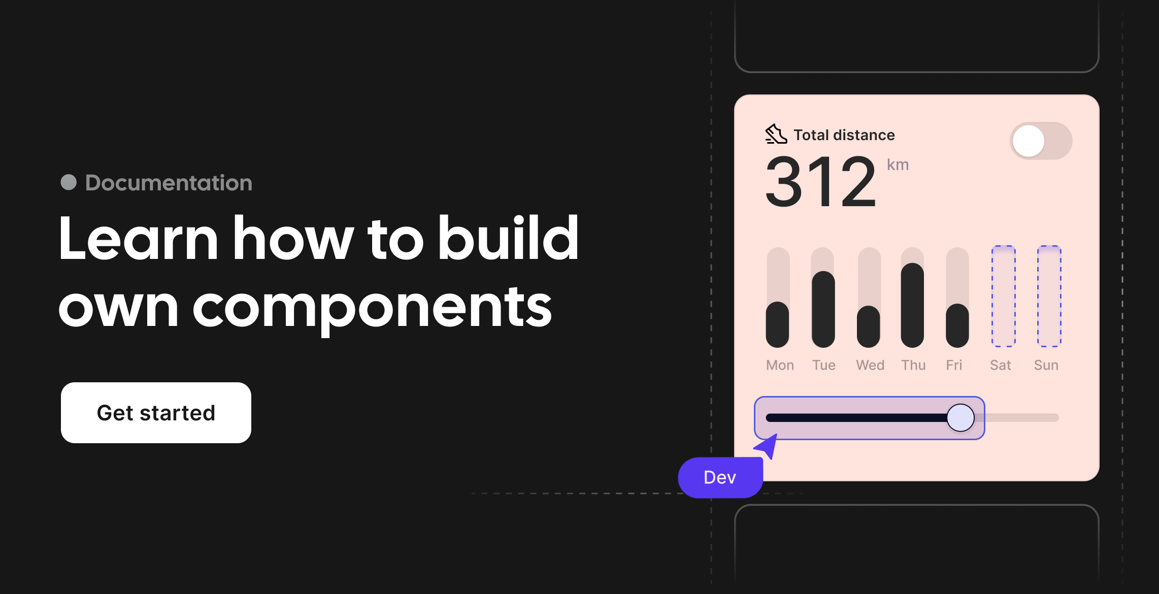
The headless components for Svelte.
Bits UI is a headless component library for Svelte focused on developer experience, accessibility, and full creative control. Use it to build high-quality, accessible UIs without giving up styling freedom or performance.
Why Bits UI?
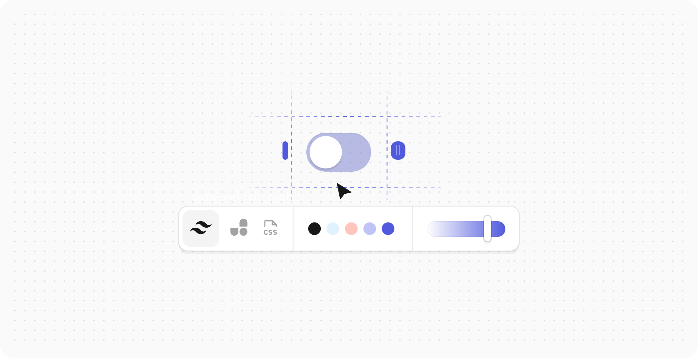
Bring Your Own Styles
Most components ship completely unstyled, with the exception of those required for core functionality. No CSS resets, no design system assumptions. You bring the styles using standard class props or data-* attributes. See the styling guide.
Building for Developer Experience
Everything is designed to stay out of your way:
- Full TypeScript coverage
- Stable, predictable APIs
- Flexible event override system
- Great defaults, easily overridden
- Comprehensive documentation and examples
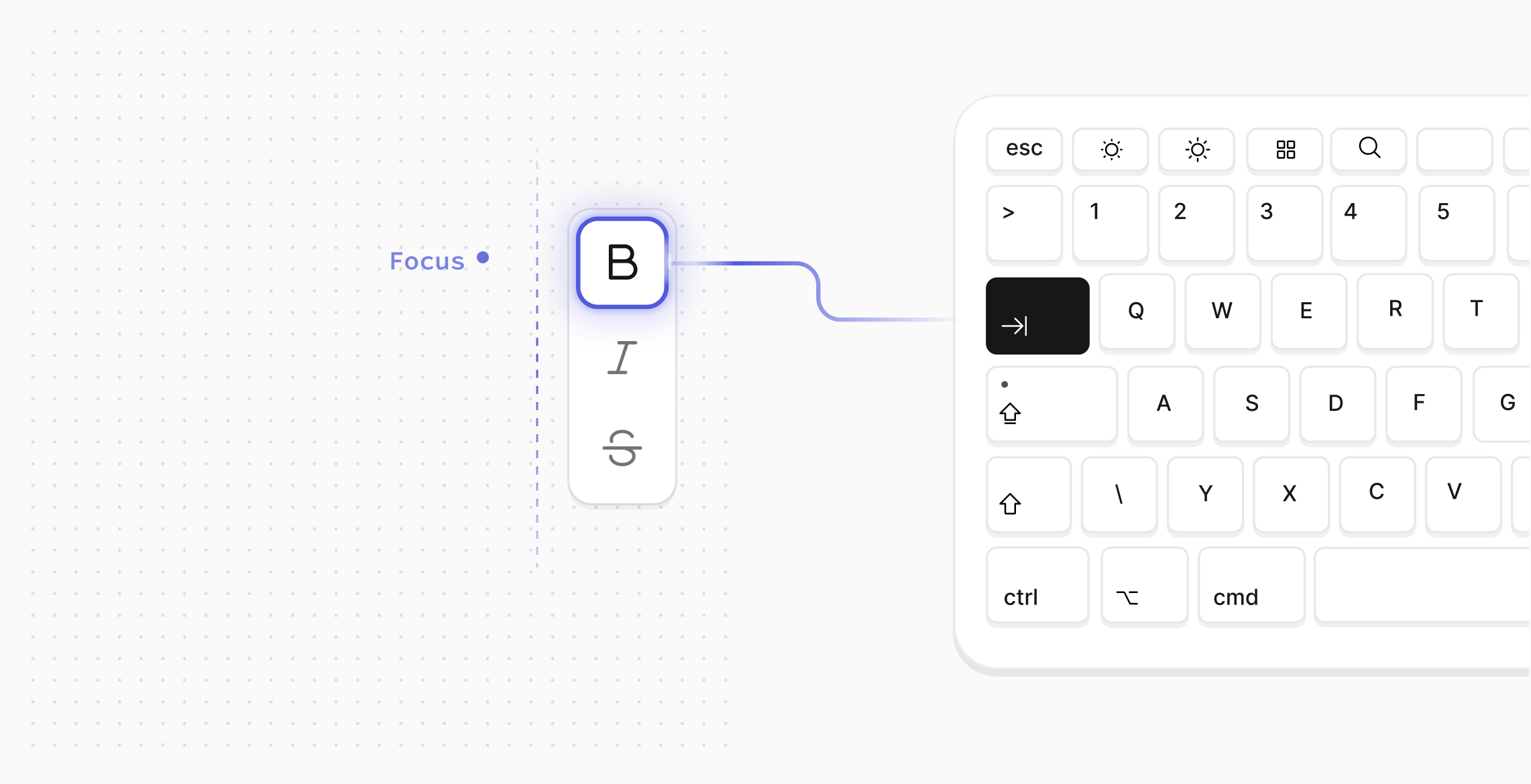
Production-Ready Accessibility
Accessibility isn't just an afterthought - it's baked in:
- WAI-ARIA compliance
- Keyboard navigation by default
- Focus management handled for you
- Screen reader support built-in
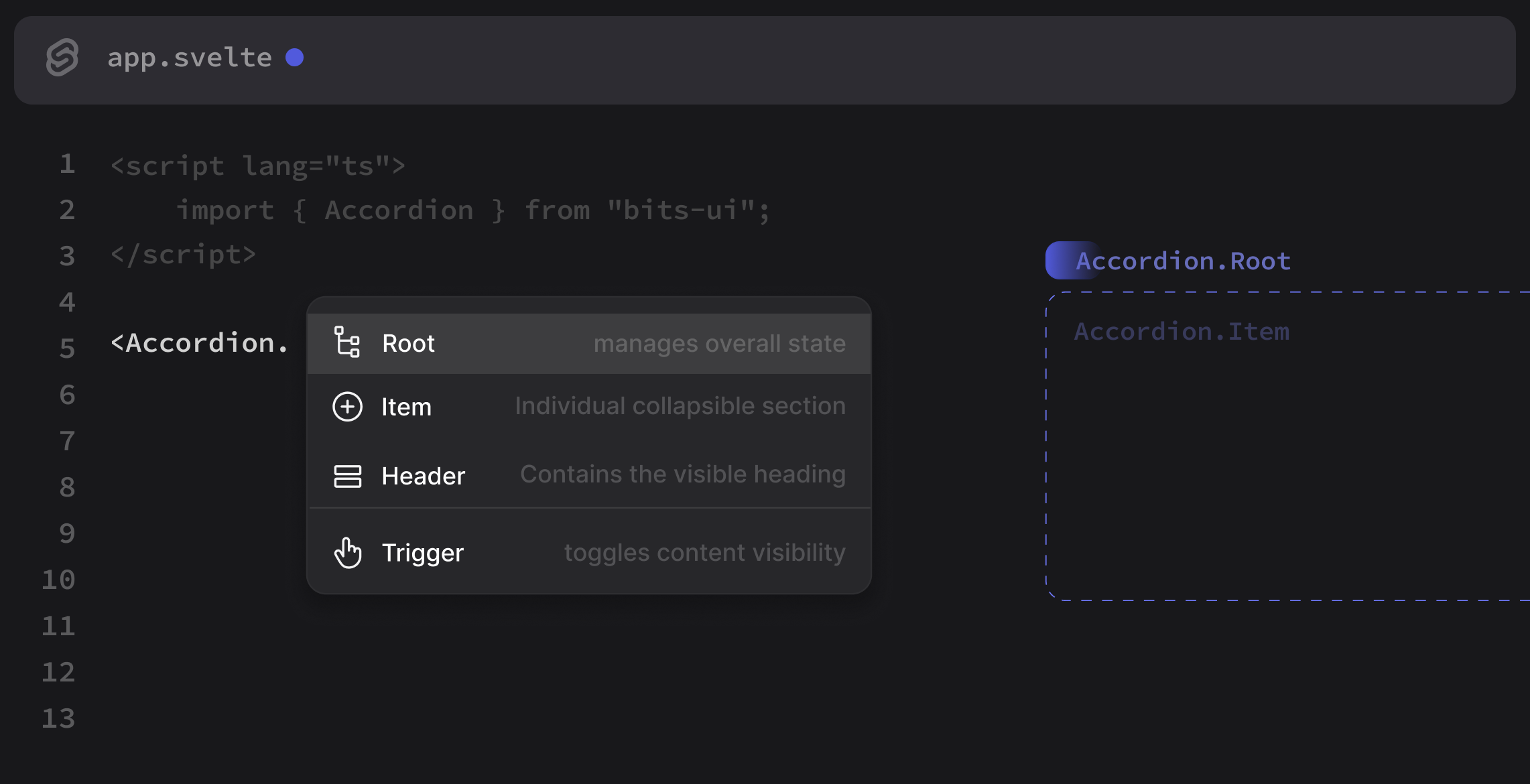
Composable by Design
Components are primitives, not black boxes. They compose cleanly and play well together:
- Render Delegation for total flexibility
- Chainable events and callbacks
- Override-friendly defaults
- Minimal dependencies
Community
Bits UI was built and is maintained by Hunter Johnston with design support from Pavel Stianko and his team at Bitworks Studio and tooling support from Adrian Gonz. Contributions, issues, and feedback are always welcome.
Found an issue? Open one. Have a feature request? Let's discuss
Acknowledgments
Built on the shoulders of giants:
- Melt UI - inspired the internal architecture
- Radix UI - API design inspiration
- React Spectrum - inspiration for the date/time components and excellence in accessibility